Best practices for responsive web design
Introduction to responsive web design
Responsive web design is a approach to web design that makes web pages render well on a variety of devices and window or screen sizes.
A responsive web page should look good on a large desktop monitor as well as on a small mobile phone. The idea behind responsive design is to build web pages that look good on all devices, whether it be a desktop computer, a laptop, a tablet, or a smartphone.
There are several techniques that can be used to create responsive designs, including fluid layouts, media queries, and flexible images and media.
Fluid layouts are one technique that can be used to create responsive designs. A fluid layout is a type of layout where the width of the elements on the page is not fixed in pixels, but instead is set in percentages. This allows the elements on the page to resize themselves automatically based on the size of the browser window or screen.
Media queries are another technique that can be used to create responsive designs. Media queries are CSS rules that can be used to specify different styles for different media types (such as screen size). By using media queries, different styles can be applied based on whether the device is being used in portrait or landscape mode, or if it has a high-resolution Retina display.
Flexible images and media are also important for creating responsive designs. Images and videos should be sized in percentages rather than pixels so that they can resize themselves automatically based on the size of the browser
What is responsive web design?
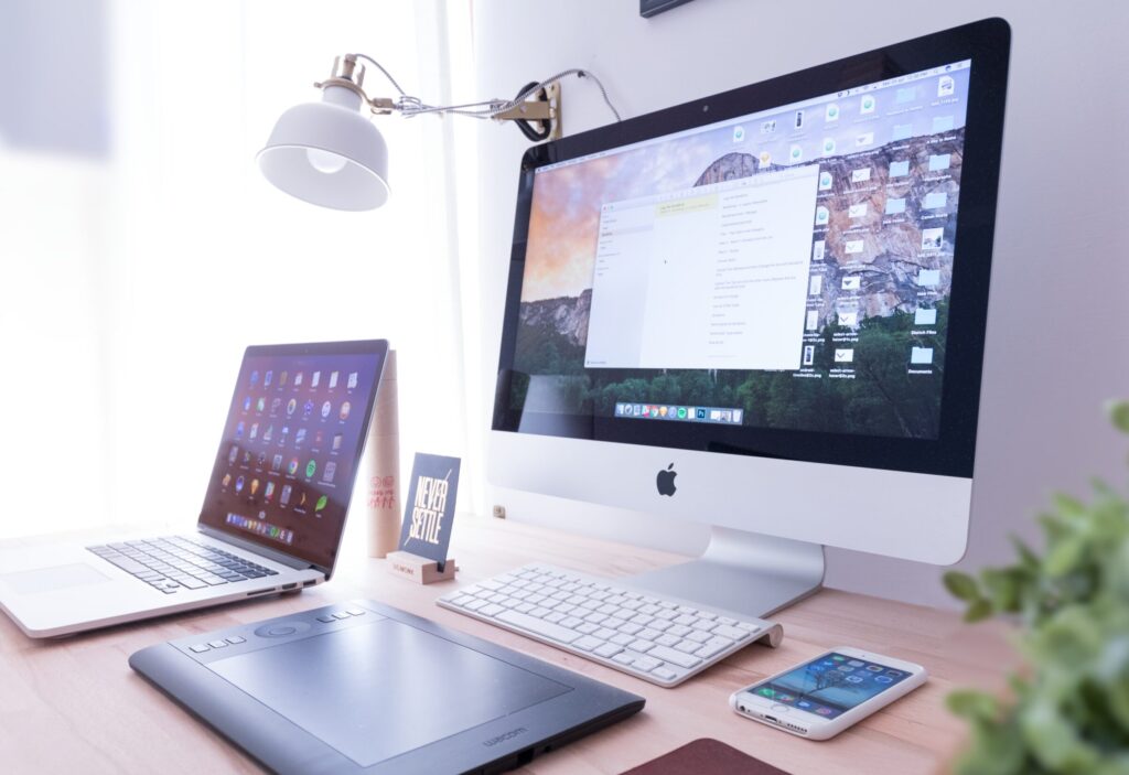
Responsive web design (RWD) is an approach to web design that makes web pages render well on a variety of devices and screen sizes. In other words, it makes your website look good on all devices (desktops, laptops, tablets, and phones).
Why is responsive web design important?
The answer is simple: because people use a variety of devices to access the internet. And you want your website to look good—and work well—on all of them.
In the past, designing for multiple devices was a challenge because each device had different screen sizes and resolutions. But with responsive web design, one website can adapt to any screen size. That’s why it’s important to have a responsive website nowadays.
The benefits of responsive web design
There are many benefits of responsive web design, but here are some of the most important ones:
1. Increased mobile traffic: With more and more people using smartphones and tablets to access the internet, it’s important that your website is designed to work well on these devices. A responsive design will ensure that your site looks great and is easy to use on any screen size.
2. Improved SEO: Google now uses mobile-friendliness as a ranking factor in its search algorithms, so a responsive design can help you improve your search engine optimization.
3. Enhanced user experience: AResponsive design provides an optimal viewing experience for your users, no matter what device they’re using. This can help reduce frustration and encourage them to stay on your site longer.
4. Lower development costs: Building a separate mobile version of your website can be time-consuming and expensive. With a responsive design, you only need to create one site that will work on all devices.
5. easier maintenance: Responsive websites are easier to maintain than separate mobile sites because you only have to make updates in one place. This can save you time and money in the long run
How to create a responsive website
There is no one-size-fits-all answer to creating a responsive website, as the best approach will vary depending on the specific needs of your website. However, there are some general best practices that you can follow to ensure that your responsive website is effective:
1. Use a responsive design framework: A responsive design framework provides a pre-built structure for your website that automatically adjusts to different screen sizes. This can save you a lot of time and effort in having to manually code your website to be responsive.
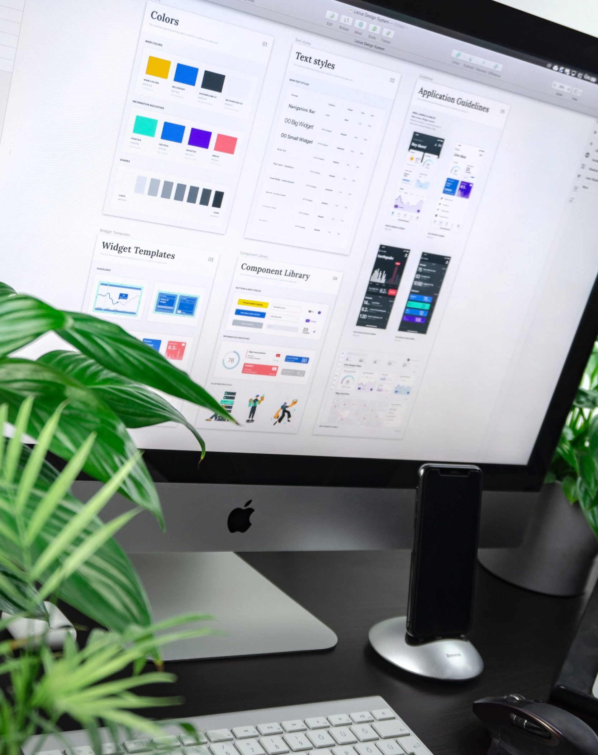
2. Optimize your images: Make sure that all of the images on your website are optimized for different screen sizes. This means using smaller image files that load quickly on mobile devices.

3. Use CSS media queries: CSS media queries allow you to specifically target different stylesheets to different device types, meaning you can have separate stylesheets for desktop and mobile devices. This gives you more control over how your website looks on different devices.
4. Minimize external HTTP requests: Every time an external HTTP request is made (for things like Javascript files, CSS files, or images), it takes longer for the page to load. So, it’s important to minimize the number of external HTTP requests by using techniques like inline CSS and spriting images.
5. Leverage browser caching: When a visitor loads your website, their browser will cache certain elements so that they don’t have to be downloaded again
Responsive web design tools and resources
As the mobile market continues to grow, it’s important for web designers to create websites that look good on all devices. Fortunately, there are a number of responsive web design tools and resources available to help.
One of the most popular responsive web design tools is Bootstrap. Bootstrap is a front-end framework that includes a number of pre-built CSS and JavaScript files. These files make it easy to create responsive websites without having to write all of the code from scratch.
Another great tool for creating responsive websites is Foundation. Like Bootstrap, Foundation includes a number of pre-built CSS and JavaScript files. However, Foundation also includes a number of additional features, such as a grid system and support for Sass.
If you’re looking for more general resources on responsive web design, be sure to check out Google’s Web Fundamentals guide. This guide covers everything from choosing the right breakpoints to using media queries.
Responsive web design is an essential part of modern website design. Following these best practices will help you ensure that your site looks great no matter what device or platform it is viewed on. Keep these tips in mind when designing and developing your next website, and you can be sure that it will look perfect for all users.