Creating a mobile-friendly website
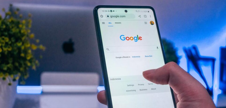
As more and more people use their mobile devices to access the internet, it’s important to make sure your website is mobile-friendly. Mobile devices have smaller screens and use touch instead of a mouse, so your website should be designed with these differences in mind.
There are a few things you can do to make your website more mobile-friendly:
1. Use responsive design. This means that your website will automatically adjust to fit the screen size of the device it’s being viewed on.
2. Use large, easy-to-tap buttons. This will help users navigate your site on a smaller screen.
3. Use simple, uncluttered designs. Too much information on a small screen can be overwhelming for users.
4. Use short, concise text. Again, less is more on a mobile device.
5. Optimize your images for faster loading times. This is especially important on mobile data connections where speeds can be slower than on a desktop computer.
By following these tips, you can make sure your website is ready for the growing number of mobile users.
Designing for the small screen
Designing for the small screen can be a challenge, but it’s important to remember that creating a mobile-friendly website is key to reaching your audience. Here are some tips to keep in mind when designing for the small screen:
1. Use a responsive design: This will ensure that your website looks great on all devices, from smartphones to tablets to desktop computers.
2. Keep your content concise: Mobile users have shorter attention spans than desktop users, so it’s important to get your point across quickly and efficiently.
3. Use large, legible fonts: Small screens can be difficult to read, so make sure your text is large enough and easy to read.
4. Use plenty of whitespace: This will help break up your content and make it easier to scan.
5. Avoid using pop-ups: These are annoying on desktop computers, but they’re even worse on mobile devices. If you must use them, make sure they’re easily dismissible.
By following these tips, you can ensure that your website is mobile-friendly and easy to use on any device.

Testing across platforms and devices
Creating a mobile-friendly website can be a challenge, especially when it comes to testing across platforms and devices. Here are some tips to help you get started:
1. Define your goals. What do you want your mobile site to accomplish? Do you want to provide information, sell products, or both? Keep your goals in mind as you design and test your site.
2. Consider your audience. Who will be using your mobile site? What kind of device are they likely to be using? Make sure your site is designed with your audience in mind.
3. Simplify your design. Mobile users are often looking for quick, easy access to information. Keep your design simple and easy to navigate.
4. Test, test, test! It’s important to test your site on as many different devices and platforms as possible. This will help you identify any potential problems and ensure that your site is accessible to the widest possible audience.

Optimizing navigation for mobile users
Most web developers are aware of the need to optimize their website for mobile devices. However, many are not sure how to go about it. This article will provide some tips on optimizing navigation for mobile users.
The first thing to consider is the layout of the website. The layout should be such that the content is easy to read and access on a small screen. This may mean making use of a single column layout or using larger font sizes.

It is also important to consider the way in which mobile users navigate websites. Often, they will use their finger to scroll up and down the page. As such, it is important to ensure that links and buttons are large enough to be easily tapped.
Another consideration is the use of pop-ups and overlays. These can be problematic on mobile devices as they can obscure the content beneath them. If possible, it is best to avoid using these elements on mobile versions of websites.
Finally, it is worth bearing in mind that many mobile users do not have access to high-speed internet connections. As such, it is important to ensure that website pages load quickly. This can be achieved by keeping file sizes small and by using caching techniques.