Rules for web design that will make your brand a success

1. What is the web design service?
To create a cohesive visual identity, the web design process should be viewed as a whole. A brand that is successful is easily identifiable.
Based on the requirements of the client and the industry it is in, optimized content and a marketing strategy can be created to attract clients and collaborators. Web design includes the creation of banners and a layout with functional buttons. Sliders are used to make navigation easier on the site. The design of a website can be the first thing to convert a visitor into a customer right away.
These are the steps to create a website.
1.1 The web design concept is projected.
We can develop a plan for the development of this project by understanding the objectives, site profile, and client goals. It is more difficult to customize an eCommerce platform for an online shop than a service presentation website. Next, choose the appropriate colors and logo.
1.2 Visual aspect creation that is effective
We then define the visual style after designing the site’s structure. Visually, the key elements of the brand will be reproduced in banners, communication methods and the structure of this site. UX specialists assist in integrating and enabling functionality.
1.3 Web content development
Once the HTML and CSS structure has been established, we can begin to make it perfect. You can add design elements that reflect the current trends to the visual side. These elements are meant to catch the eye and keep the visitor interested for as long as possible. You can insert clips, animations sliders, podcasts chat-bots, and other interactive elements.
1.4 Review and testing.
The client will have access to the Beta version of the designed site until it goes live on its own production server. There will be no errors that could compromise the site’s functionality.
1.5 Launching the website
The site is now ready for public access after all corrections and modifications have been made. You can now move on to online promotion and marketing to make your page visible.
1.6 Maintenance
The web maintenance service can be used if you need to make changes on the backend. The site will remain optimized and fully functional regardless of any promotional campaigns or changes.
2. What are the benefits of a book-like layout?
The website’s graphic design tells the story of the brand online. A brand that is loved and recognized is one that stays in our collective unconscious. Professional design is a way to build your business and be appreciated by clients and colleagues.
These are the main advantages of a book-like layout:
– Your online experience is well-rated. The first impression is important, regardless of whether it’s the outdoor or digital environment. A website is a gateway between you and customers. Because the mass media is flooded with advertisements and advertorials, you only have a few seconds in which to grab his attention. A good first impression is made with concise and attractive messages. Professionalism equals more customers.
The site is fully functional. The design and programming teams should work together to create a website that is appealing and will keep users online. Once you have attracted the user to your website, it is important to keep him there.
The presentation site and shop are both in fashion with the latest web design trends. You should include animated visuals, clips and chatbots as well as broadcasting, online streaming, video streaming, and photo sliders.
Increase your reach and increase sales. A site that is well-designed and adaptable to market needs will be more user-friendly. The same goes for web and mobile applications.
Highlight your products and offers better. An online store can promote their promotional offers from the very first page. These can be displayed as sliders, pop-ups or vouchers. Customers will be more interested in seeing the discounts or services they need in the most appealing and simple way.
3. What is responsive design?
Ethan Marcotte introduced the concept of responsive design to the online marketplace in 2010. This article focuses on three key elements that make a website responsive. This function is both in the programming and the interface. It involves optimizing the site for the viewing environment. This means that both the site and the images are adjusted to the resolution of the device from where the page is accessed.
This can be done on a desktop, laptop or tablet as well as a smartphone. The images are not affected by a change of resolution. It is used to improve the browsing experience.
Creating a responsive design requires:
3.1 Fluid grids.
The resolution of the device used to scale the images determines the scaling. Borders and frames can be adjusted to fit the resolution of any device.
3.2 Responsive Images
Images from the website must be properly viewed on both desktops and smaller screens such as phones. These images are saved to the server in multiple sizes so they can be viewed on the appropriate device.
3.3 Media Queries
Media queries allow you to load CSS functions at the desired resolution. This requires the implementation of appropriate CSS properties. They adjust automatically to the device being used. The banners or images created will be uploaded to the website in multiple sizes. The layout will be displayed correctly if there are multiple identical images of the same image.
Any company can benefit from accessibility on any device. Customers can access your website from anywhere they are and place orders. You can browse with ease without any errors, such as too many pictures or non-functional buttons.
4. A list of tips to help you create a website
Website design is what makes a first impression on visitors. It must follow the most recent trends. Modern presentation websites or online shops highlight the products and services offered first. From the very beginning, it is important to draw attention to their offerings. A web agency should be focused on providing information that is well-structured, including interactive banners, testimonials, offers, and SEO content.
These are the top things to do for any website type:
– Who is the target audience for the branding/rebranding process? We will use different languages and applications if we are talking about attracting customers. Websites and marketing campaigns should be created keeping in mind the objectives.
It must be clear and easy to understand for the user. It should be simple and useful! It is easier to find the product or service that you are looking for by categorizing your buttons. Clear structure and an appealing visual will ensure that you are successful in converting your visitors.
– Short texts, call to actions messages and text. It is the content that sets up a website’s foundation in Google search or social media channels. Keywords are the ones that relate to the searched products. How do you do this? You place yourself in the shoes of your customer and imagine what he is looking for. It will be easier to create content that is unique for a user by knowing his interests, passions, and wishes.
Search engine optimization (SEO) – The engine behind all search queries. SEO is the engine that brings life to your website. What happens if your business does not appear on the first page? Optimized content is required. What does this mean? What does it mean?
– Content must be consistent with the images. Good copy is always a team effort and produces smart results. A visual that compliments the text will make a bigger impact. Your website will be remembered by the user, whether it is a humorous message or one that is of personal interest.
Scroll down and find. A site that is easy to navigate allows users to find the information they need first. The site should be easy to navigate for new users. This must also include the server. If the site does not have optimization, large images will load slower. Navigation is easier when pages load quickly.
To better communicate the content, name and offers, you should place more emphasis on quality and clear photos. Users don’t have the patience or time to scroll down pages so important information should be at the top of the page.
5. Avoid these mistakes when designing a website
Learning from our mistakes helps us to improve our presentation skills. A book-like design ensures a well-rated site.
These are the top 10 rules of website design.
1. Website isn’t clear and doesn’t tell you from the first page what it does or what its profile is.
You have five seconds to grab someone’s attention. A poorly designed layout and difficult navigation will make it difficult for users to find what they are looking for. It must include a list of products/services and testimonials.
2. Website is not responsive
Many people use their smartphones to navigate and order products online. If the website is not responsive, images and products will not be displayed correctly.
3. Site loads very slowly, taking more than 5 seconds
Online life is quick and fluid. People don’t like to wait. According to studies, most people expect websites to load in less than a minute.
4. Website has difficult-to-read fonts and small letters
The choice of font is one of the biggest mistakes. No matter if you are creating a website for a PC or a mobile app, the font must be legible and have appropriate letters.
5. Complex User Experience with many tabs to open
Online experience is key. The user will abandon the page if there are too many new navigation pages, especially for mobile.
6. Your site doesn’t have well-structured and clear categories, or poorly directed buttons
Who doesn’t want information in a click? As much as he would clap, a link and a button clearly show what the user is looking for. Web browsing should allow for enough space between menus and links.
7. Subtitles are not used to divide the site (H1, H2, and H3, H4, H5, and H6).
Banners and subchapters are the areas of focus for users. These are important for SEO. Google indexes keywords that are placed in subtitles and titles more easily.
Your rank and position in Google search bots and search algorithms to direct users to your site. The bots won’t store any information if the listing isn’t done correctly. Your site will be removed from the search results pages.
8. Contact details and a contact form are not available.
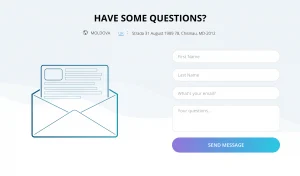
According to studies, 64% of website visitors search for contact information. 44% leave the site when they have a number. If there are already pages, not many people will insist on searching for the business online. A contact form and company contact data must be kept separate. Chatbots and quick call functions are important applications that must be maintained. They indicate that there is interest and the possibility of getting in touch with you as quickly as possible.


